Ready to get started?
Easily integrate next-generation payments and financial data into any app. Build powerful products your customers love.
E-commerce sales are worth around 6 trillion USD worldwide, accounting for 20% of retail sales. It’s an alarming amount of money and shows how society’s views have changed in just a few decades. Online shopping has evolved significantly since its inception in the 1990s – checkout innovations happened so fast, and consumers didn’t see them coming. Shopping moved from an in-store experience to something done on a desktop computer to today’s handheld devices and digital wallets. But how did we get here?
Online checkout innovations: a timeline
Like most good things, e-commerce’s humble beginnings were in the 90s, when Amazon and eBay crept onto the market. It didn’t take long for them to become the biggest online retailers, but shopping online took way more patience than now. There wasn’t much competition and the long and unreliable checkout process, so consumers still used brick-and-mortar stores.
Things got better in the 2000s. More retailers started showing up online with streamlined checkout solutions. As technology improved, so did security and trust. The introduction of SSL (Secure Socket Layer) encryption made online shoppers feel safer entering payment details. Facebook Marketplace and Etsy introduced new online shopping communities, plus people started using smartphones to shop more.
The 2010s were all about making shopping online an even better experience. Stores started using data to give us better shopping experiences and suggest things shoppers might like. We could now shop the same way, no matter how we were doing it – on our phones, laptops, or in stores. Social media started selling products, and Amazon Prime offered subscription services with monthly fees, including free shipping.
Fast forward to the 2020s, and we have countless ways to shop online. We can use VR to see what a kitchen looks like before we buy and talk to devices to finalise purchases. As we develop new ideas and technology, online shopping and checkout innovations will evolve and be tailored closer to consumers’ needs. Think of it as a bespoke suit – it needs a few nips and tucks as you grow…

The current e-commerce checkout flow
Now we’ve had a quick history lesson, let’s dive into the reality of the current e-commerce checkout flow. Whether you’re buying a new air fryer or pair of Nikes online, here’s what usually happens:
Cart them: You see the Air Max of your dreams, and yes, they have your size! Into the cart, they go.
Got everything? It’s time to navigate to the checkout page, usually in the top right corner.
Review: You check your cart and review details like quantities, checking no extras have slipped in by mistake.
Time to pay: Next, it’s time to part with your cash. Usually, there will be a button that says proceed to payment. Click it!
Padlock there? Here, it’s good to check the site is secure, signified by a padlock next to the URL. Then, provide billing information, like name, address and payment method. A good site should offer users a variety of ways to pay.
Ship the goods: Then, choose to ship and add discount codes or promos if applicable.
Order complete: Review once again and submit your order and payment. You’ll get an SMS or email order confirmation. Wait patiently for the goods!
It seems simple, so what can go wrong? According to recent research, UK shoppers have the lowest tolerance for bad online checkouts, with over a third finding a different site when encountering frustrations. But how can e-commerce business owners make sure this mess is avoided?
Understanding customer behaviours
Even the best e-commerce checkouts can come with pain points. Unfortunately, slow loading times and a lack of payment options might mean customers abandon carts to choose a different retailer. Here’s a look at the problems and solutions to provide a user-friendly payment flow:
| Online Checkout Problem | Innovative Checkout Solution |
| Long and drawn-out process: Customers can be discouraged by filling out lengthy forms and having to click through various unnecessary pages. | Efficiency is all you need: Offer a seamless checkout experience free from frustrating detours. You need clear navigation with minimal steps involved. |
| Long loading times: Research in 2017 by Akamai found that 53% of mobile site visitors will leave a page that takes over three seconds to load. | Aim for a buffer-free experience: Optimise web pages to ensure fast page load times, especially for mobile users. |
| Limited payment options: Consumers are used to various payment methods and may abandon carts if their chosen one isn’t available. | Offer secure and convenient choices: from traditional cards and digital wallets to buy now, pay later services or more innovative methods. |
| Limited shipping: Many retailers now offer free or reduced shipping with subscription services like Amazon Prime. If customers shop for products readily available online, they will look for the best value here. | Time for varied shipping methods: Provide clear and transparent shipping costs upfront, including free or reduced shipping options. Collection and locker services are also a good idea for more remote communities. |
| Ropey security: Out-of-date checkouts that are glitchy or don’t meet consumers’ expectations will likely be discouraging and lose business. | Keep it under lock and key: Robust security measures protect customer information and instil trust in sharing payment details and e-commerce. Customers may be worried about scams, and this helps them feel secure. |
How checkout innovations are changing the game
E-commerce checkouts are at the heart of frictionless online transactions. You can easily increase sales, trust and reputation by providing an enhanced experience that customers are after. Keep it straightforward, free of clutter and intuitive. Do you sell USB chargeable lights? Then maybe you want to suggest your USB charger leads and plugs at checkout. It’s as simple as providing a service you would want. Here’s some extra food for thought, including a few tried and tested nuggets from existing UK retailers…
A few handy innovation ideas
One-click magic: Introduced by Amazon, one-click checkout allows customers to complete purchases in a single click, using pre-saved payment and shipping details. This streamlined approach reduces checkout time and friction, increasing conversions.
Offer guest checkout: Recognising customers’ need to shop without creating an account is important. This flexibility allows occasional shoppers to complete their purchases without the hassle of account registration, removing a potential conversion barrier.
Real-time order tracking and updates, always: Providing real-time order status and delivery updates keeps customers informed and reduces anxiety about purchases. It adds trust and boots user experience, especially when it’s also provided for delivery.
Boost sales with product recommendations: Using customer data and purchase history, e-commerce platforms can provide product recommendations during checkout. Commonly used by H&M, it can increase impulse purchases and boost order amounts.
Add alternative and new payment methods: Embracing the growing popularity of digital wallets and alternative payment methods, UK e-commerce platforms are integrating these options into their checkout processes. In 2023, more than one-third (36%) of Brits have used BNPL services at some point, which means these methods should be considered.
Voice commerce: Platforms like Ocado and Sainsbury’s now use voice assistants like Amazon Alexa at checkouts. This allows hands-free buying for busy individuals.
Try it on with AR: For products like apparel, furniture, or cosmetics, Augmented Reality technology helps customers visualise products before they buy. Glasses Direct customers can picture themselves in specs before purchasing, reducing returns and adding peace of mind. Stats suggest that 71% of e-commerce buyers would shop more often if AR technology were available.
Abandoned cart follow-ups: Reaching out to customers who left carts by email can save lost sales. Personalised reminders, discounts, or free shipping offers can entice customers to return and complete purchases.
The takeaway
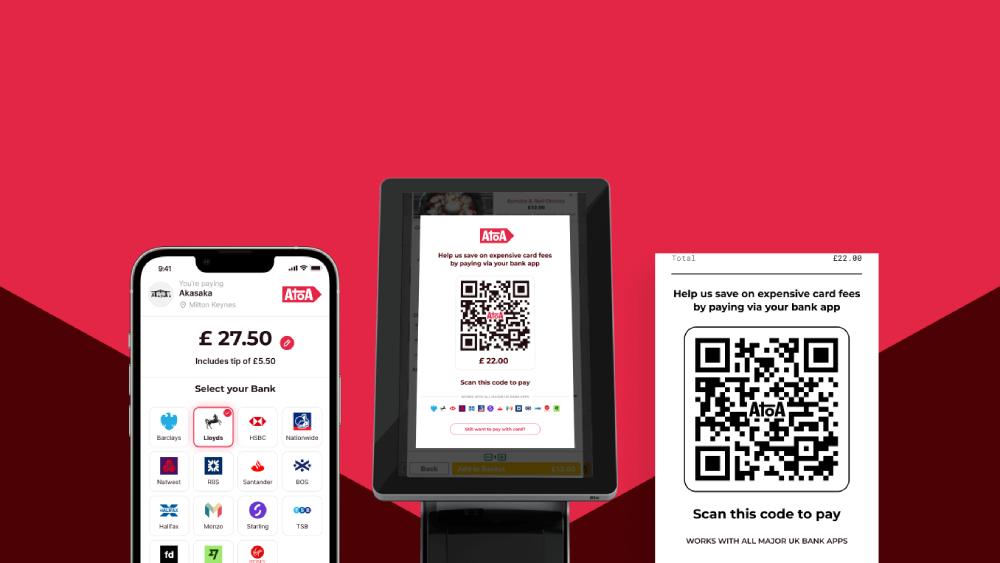
Whether you’re looking to launch a new e-commerce empire or tend to an existing one, checkout innovations are the way to go. Cutting-edge checkout technology doesn’t have to be long-winded; sometimes, it takes testing your online sales process, finding holes, and filling them. New and alternative payment integrations like Atoa can help customers pay in their phone browser with a quick and secure face scan. Recommending additional purchases or encouraging customers to “shop the look” might boost your sales and provide a more interactive user experience.
We hope this article has inspired you to build your next-gen checkout! If you want transactions to match, look at what Atoa can offer, with a seamless e-commerce plugin offering instant payments from your customer’s bank app.


